Musixmatch Rebrand
Role: Head of Design
Year: 2014

✳
We needed to enhance our identity, to create a new wider vision and at the same time I realized that the real source of inspiration was the team.
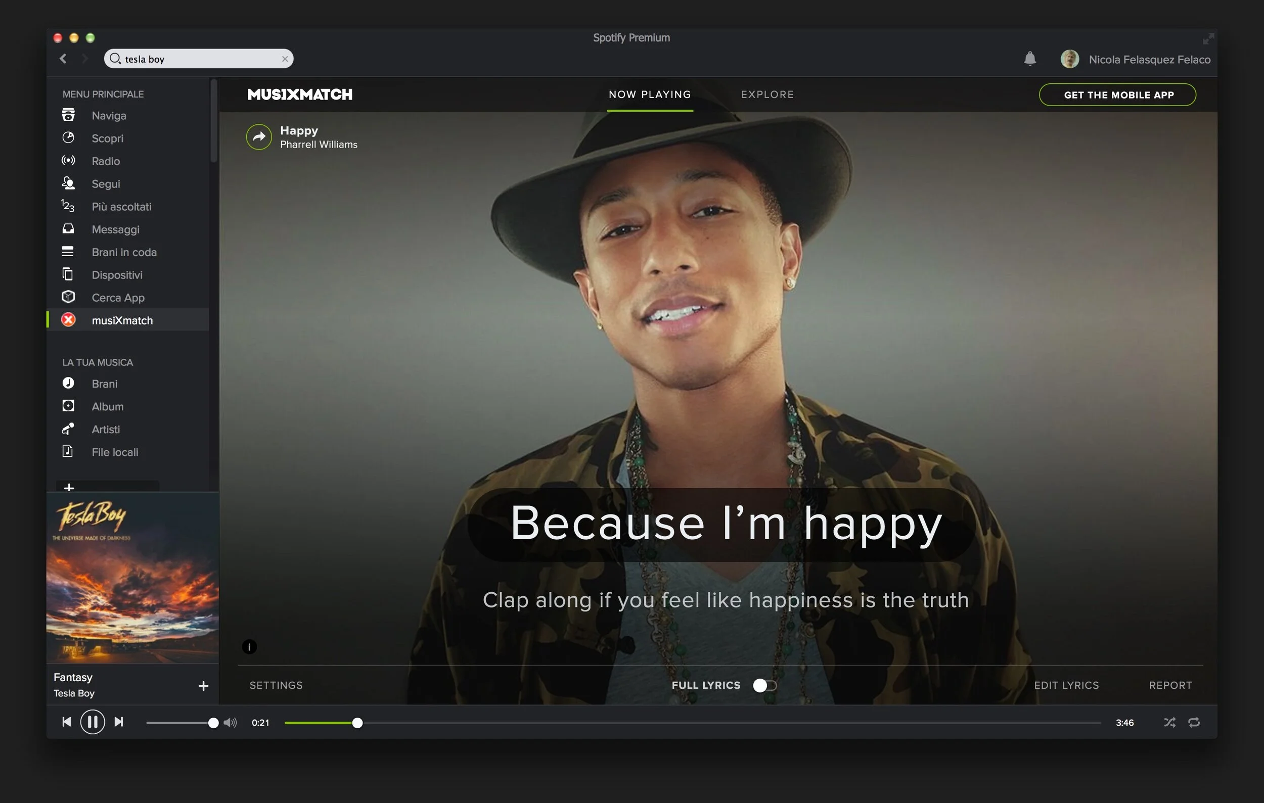
Musixmatch App redesign inside Spotify, April 2014
When I joined Musixmatch (Oct. 2012), I knew that one of the main goals was to improve the way people enjoyed lyrics creating the best possible experience. Easy?
No.
Musixmatch was already available on mobile, desktop and inside Spotify, desktop app offering synced lyrics on every song.
We gave new lynph to music redesigning the experience starting right there.
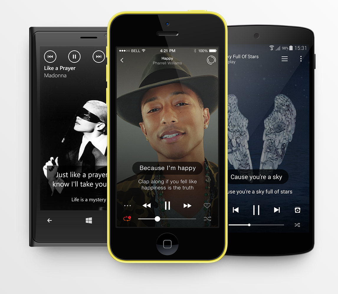
UI Design 2014
THE User Interface was smooth and fresh at that time. WE were often awarded by App stores.
We created a good design thanks to the continuous analysis, UI, Hack Days, Brainstorming, and user feedback, taking care of typography and visuals. A really nice lyrics experience that becomes educational.
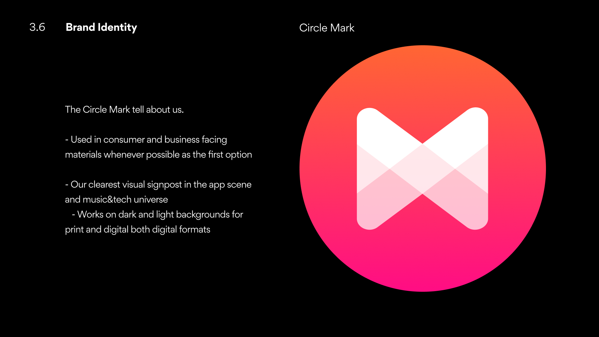
The ‘X’ as the experience.
In the meantime, we had a crazy experience showing our logo inside the key views of the apps as the welcome screens, the socials assets, and communication in general that inevitably led us to use the logotype “Musixmatch” instead of the big X.
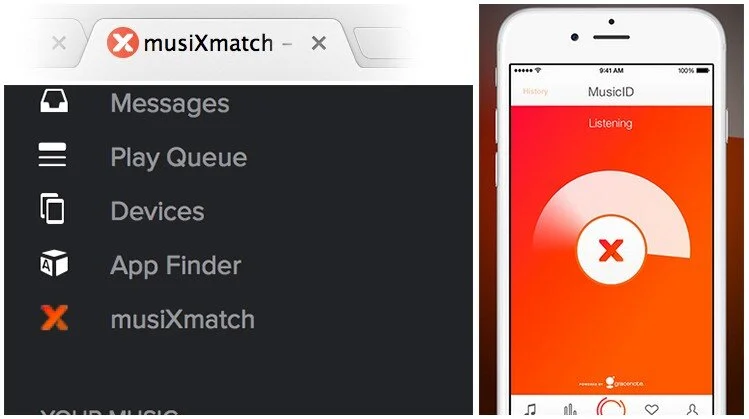
For example with the favicon for tabbed browsers and with one of the big features inside our apps that is the MusicID.
The process
Analysis
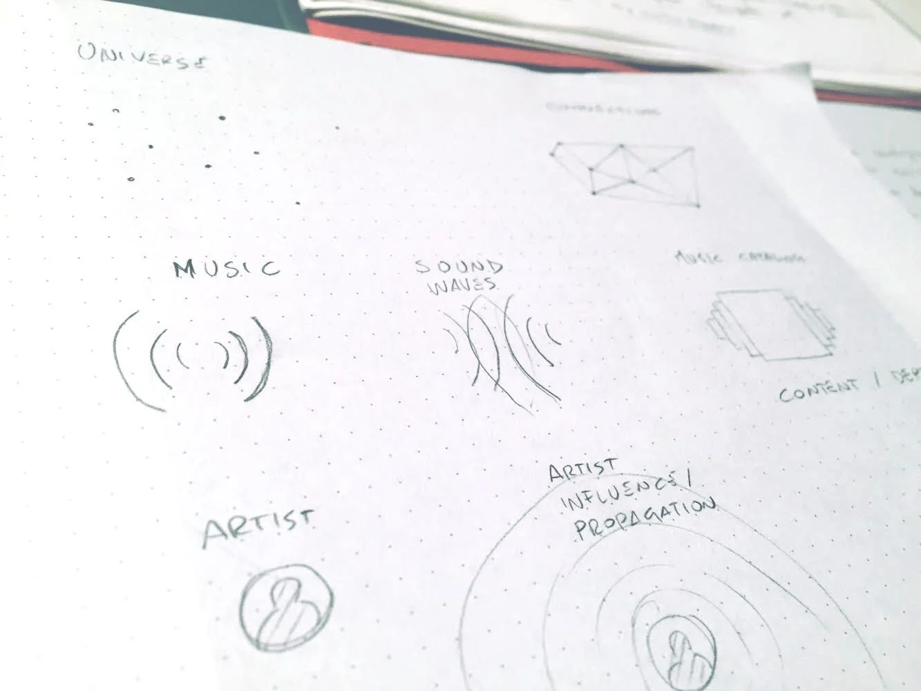
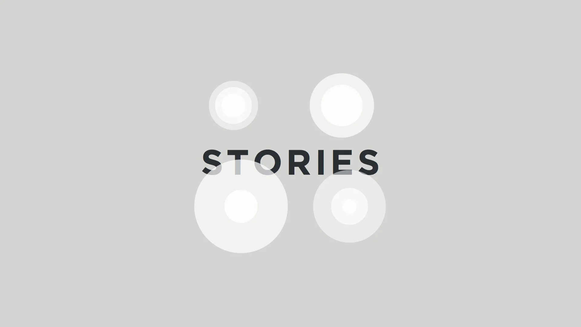
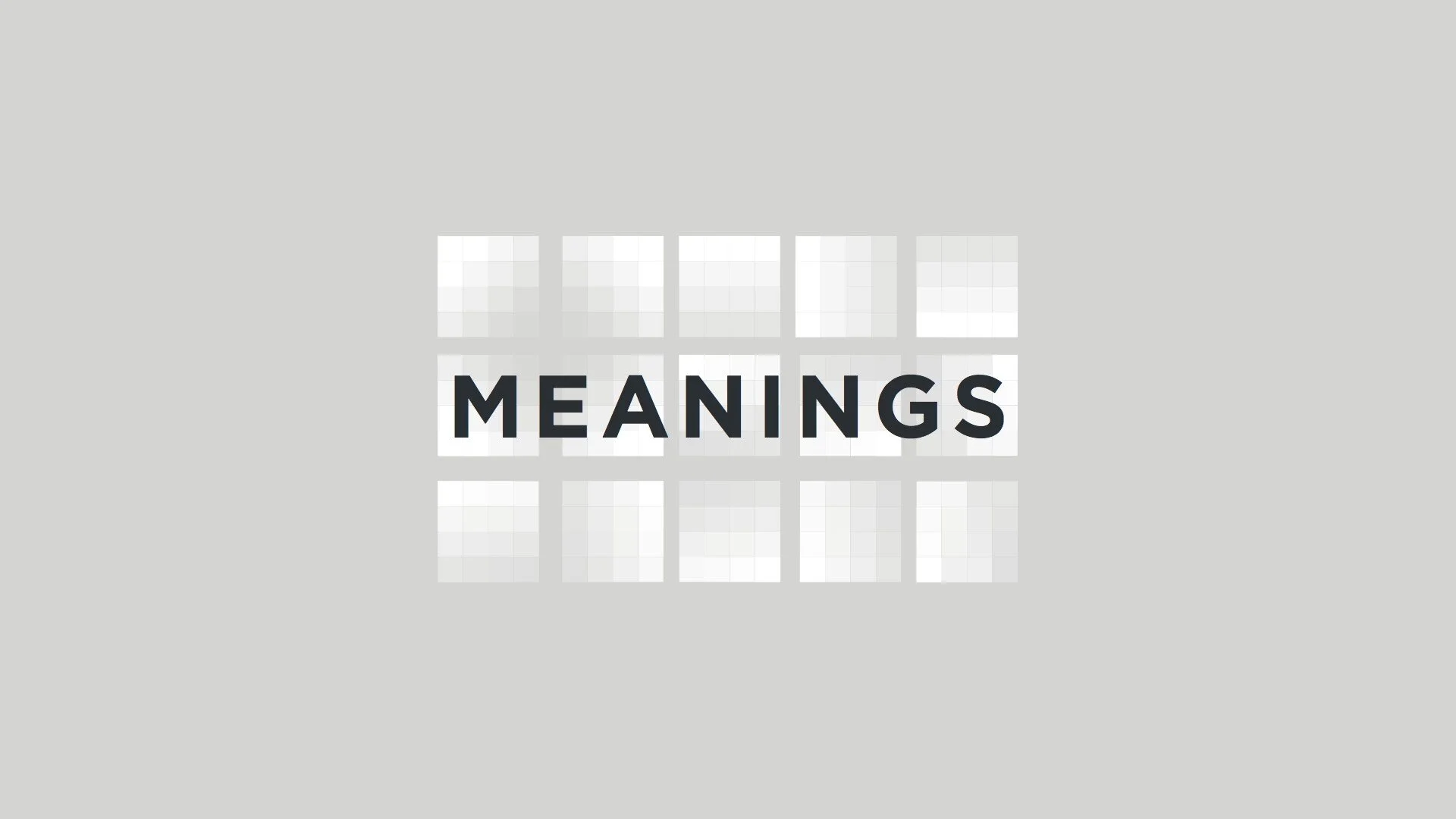
We have an awesome team that search, identify, analyze, collect, develop, sync, and connect data as Lyrics, Artists, Albums, Songwriters, Music, Meanings, Influences, Inspirations around every single part of a lyrics and all their relationships.
Oh, there is much more around lyrics!
visualize values
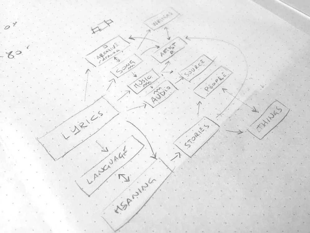
Mindmapping

2. Identify features
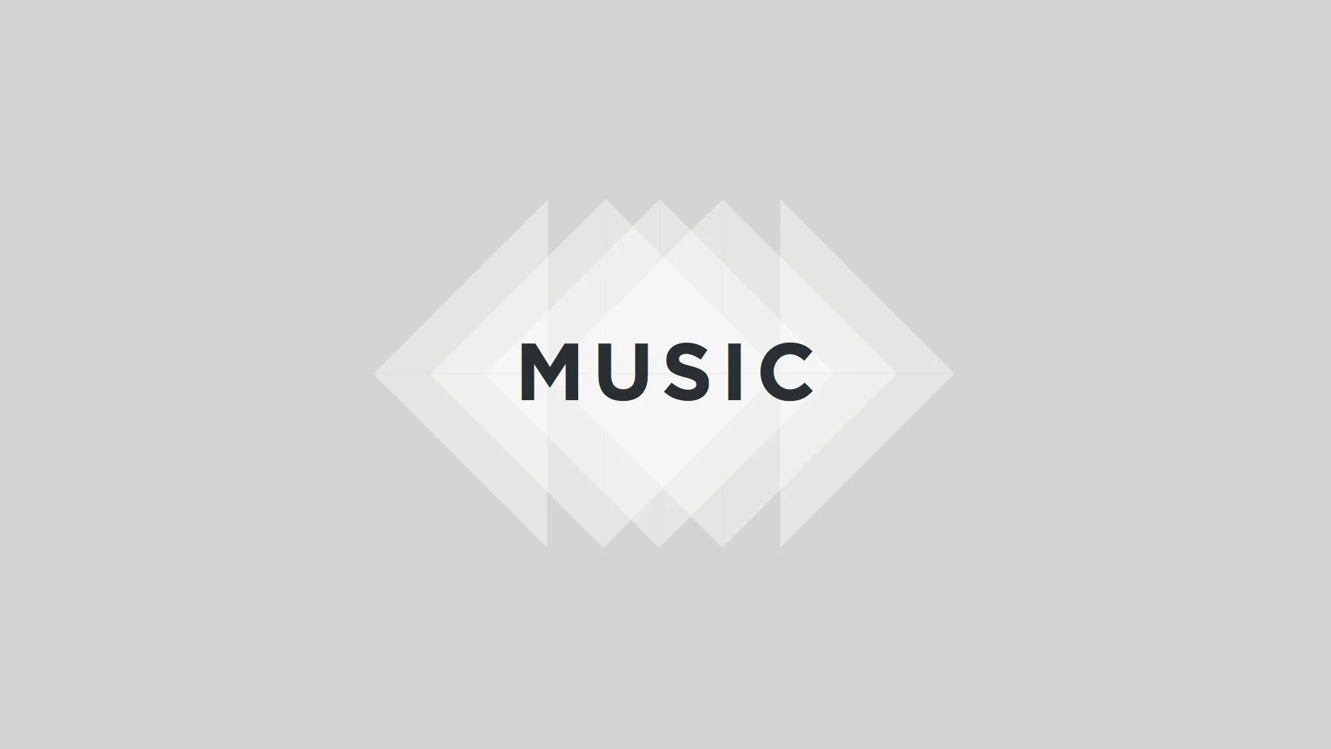
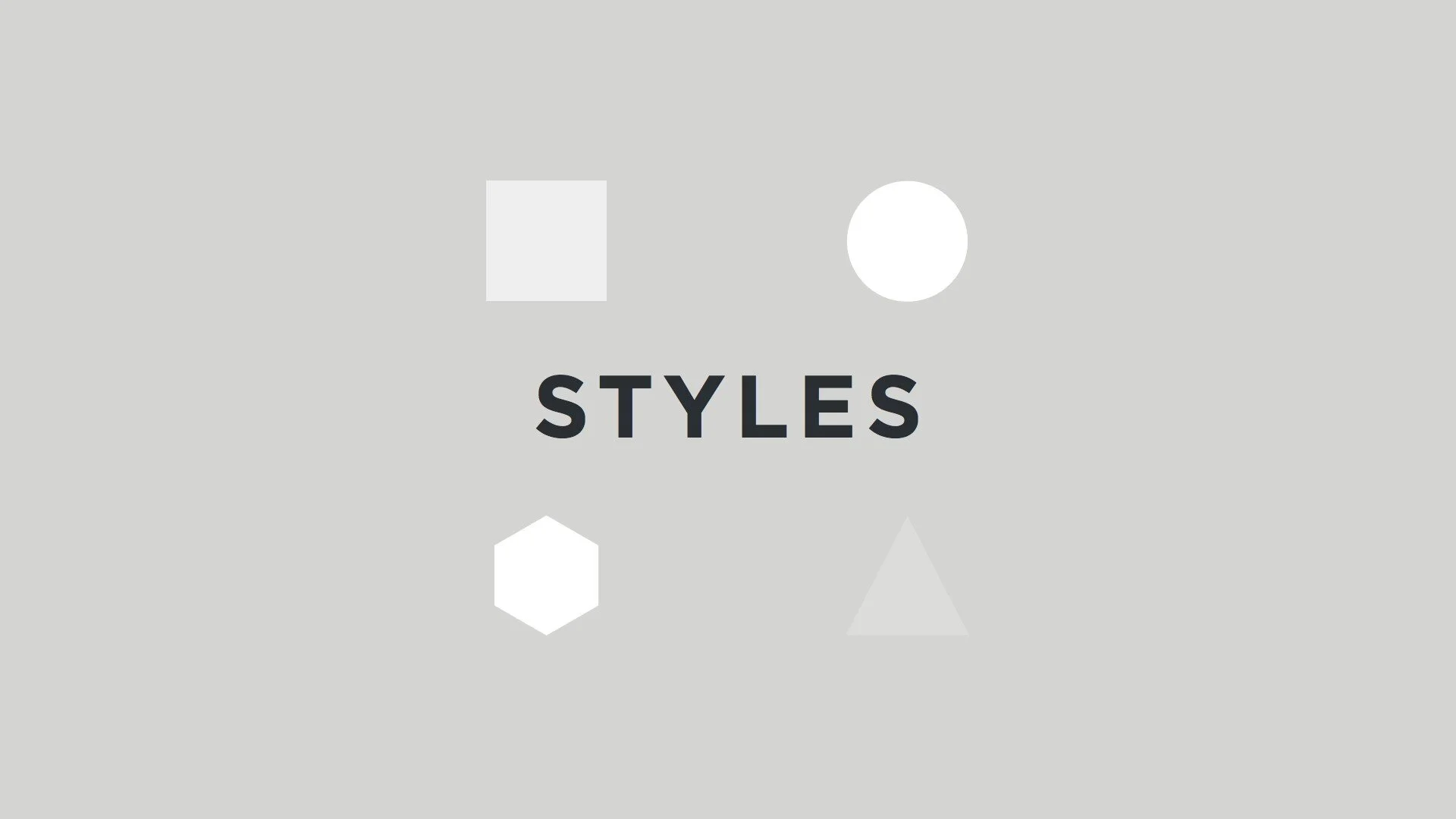
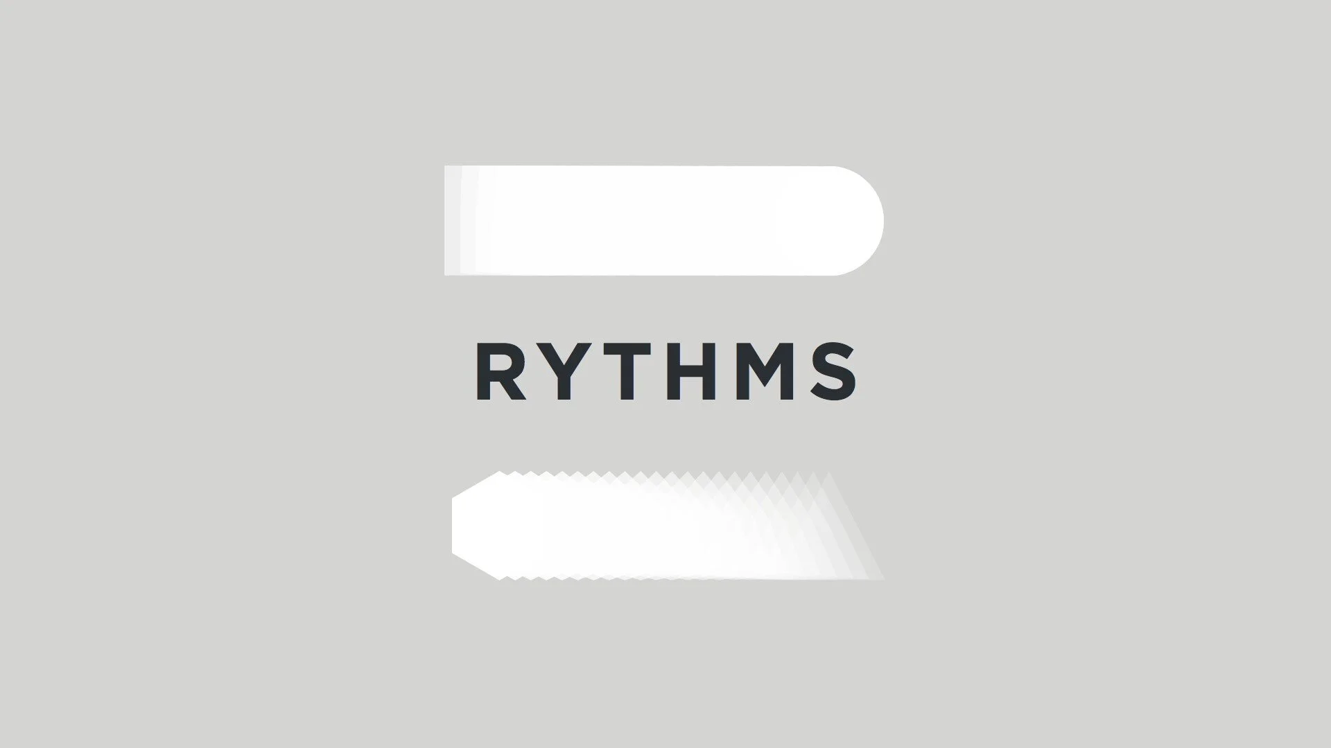
We identified the elements that allowed the development of a visual language and later to create a key to understand: squares, waves, lights, shades, connections. Every aspect of our experience suggests the features for the new logo:
Data.
Searchability of a resource in terms of speed and accuracy;
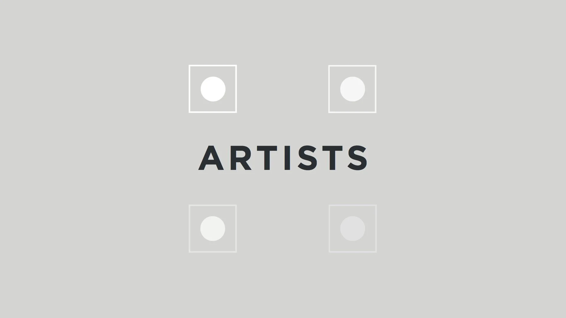
Artist.
The personality that differentiate an artist from another;
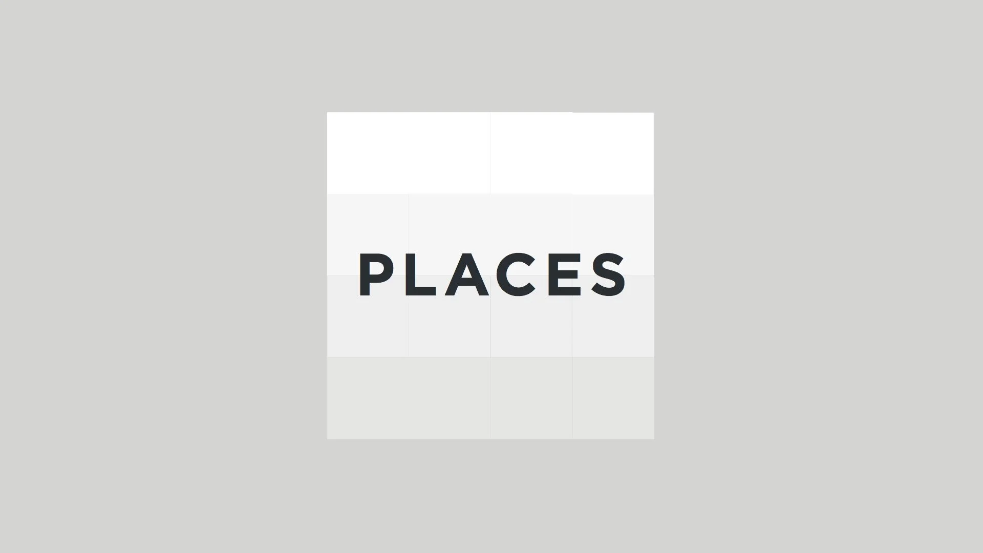
Lyrics Catalog.
The depth of informations;
Artist.
The personality that differentiate an artist from another;
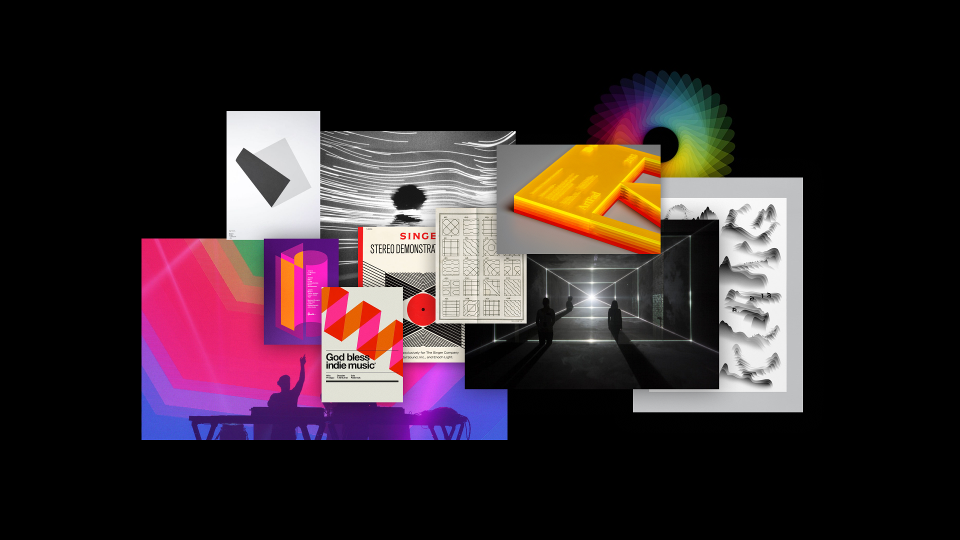
Moodboard

3. The foundation
—
I developed a small book as a foundation of the brand principles that will allow future design teams to evolve the brand on top.

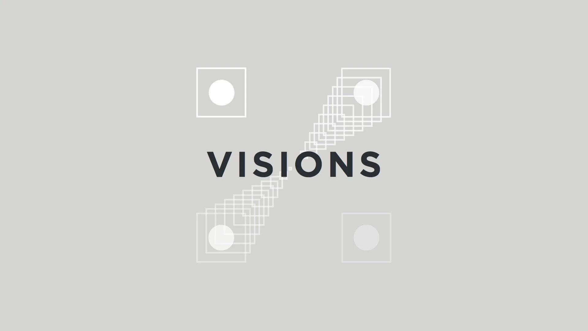
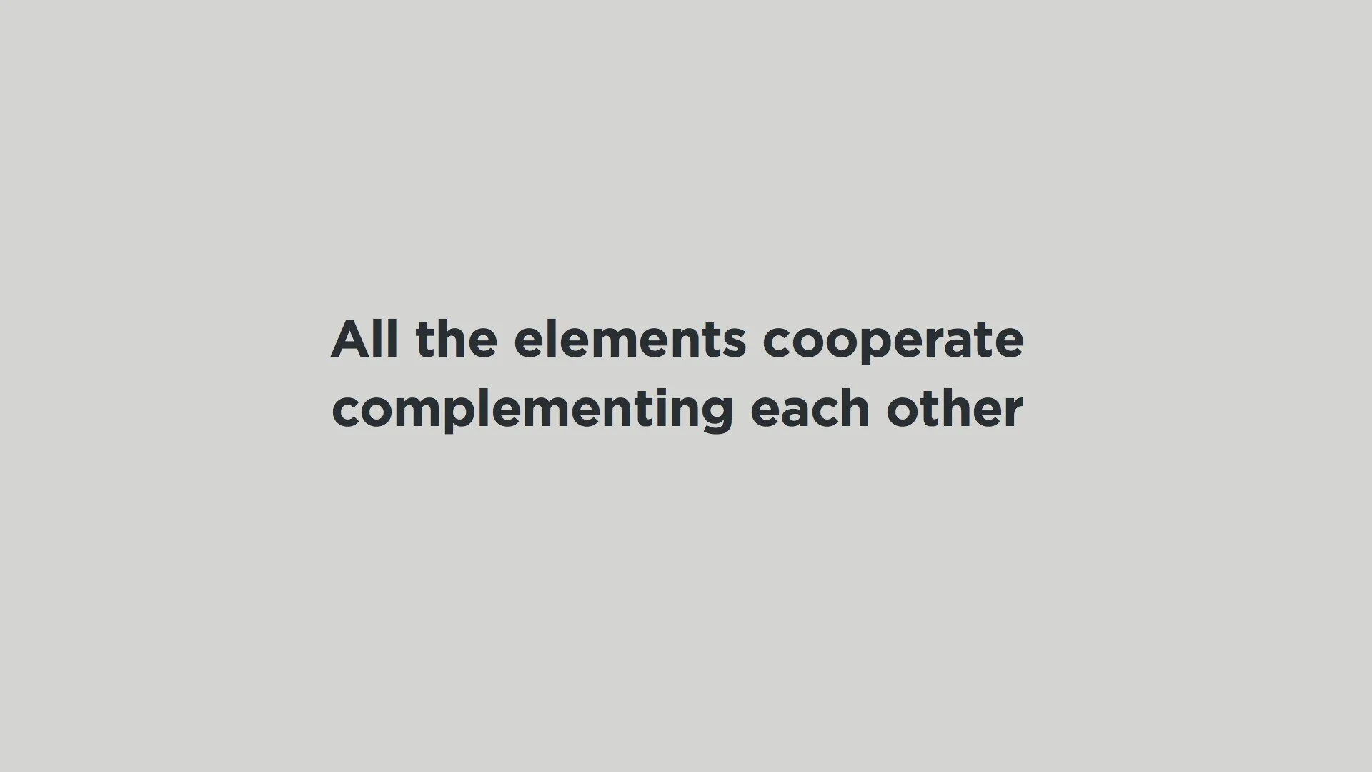
4. Values form a vision
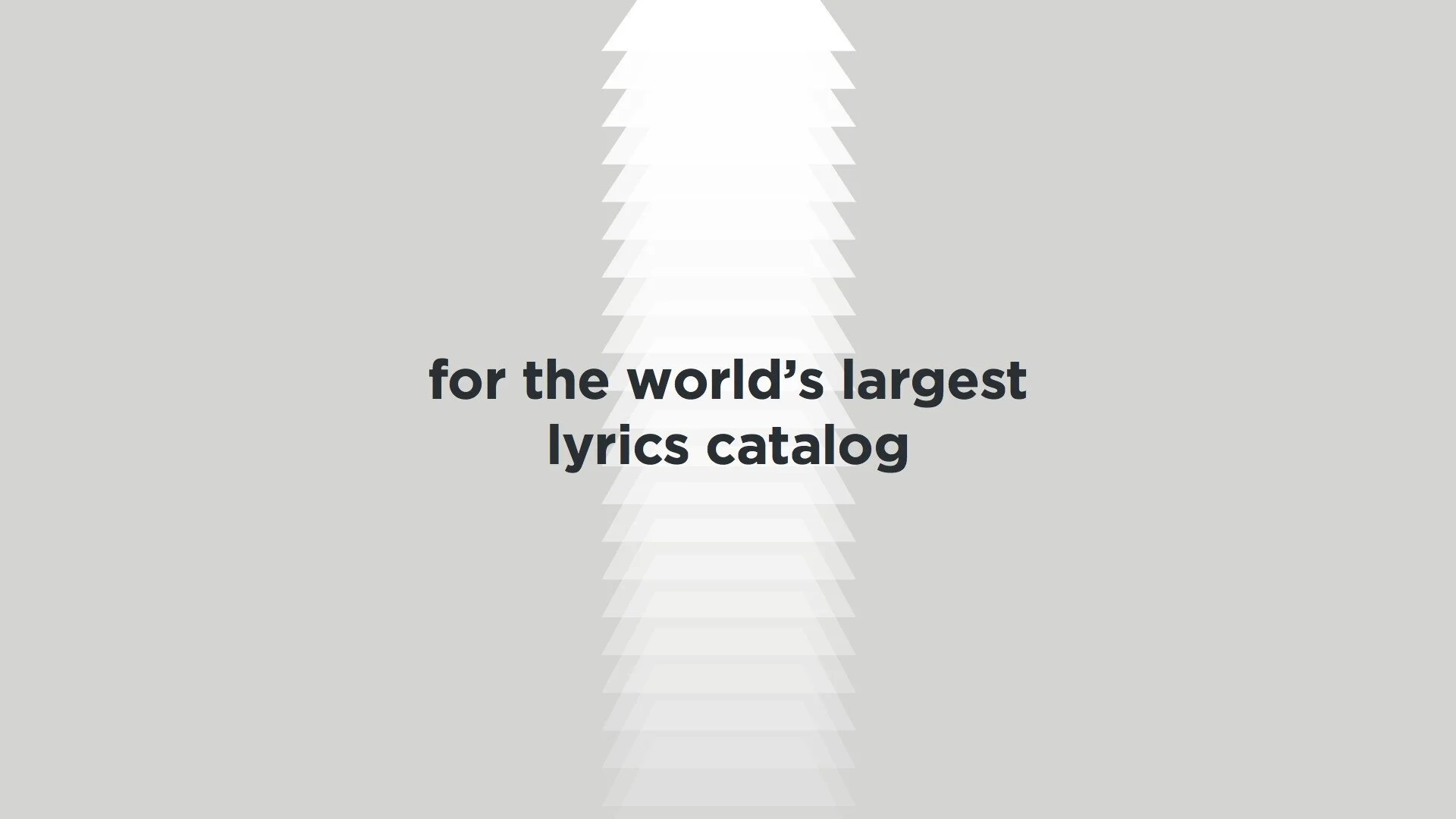
All the elements should cooperate complementing each other
for the world’s largest lyrics catalog.


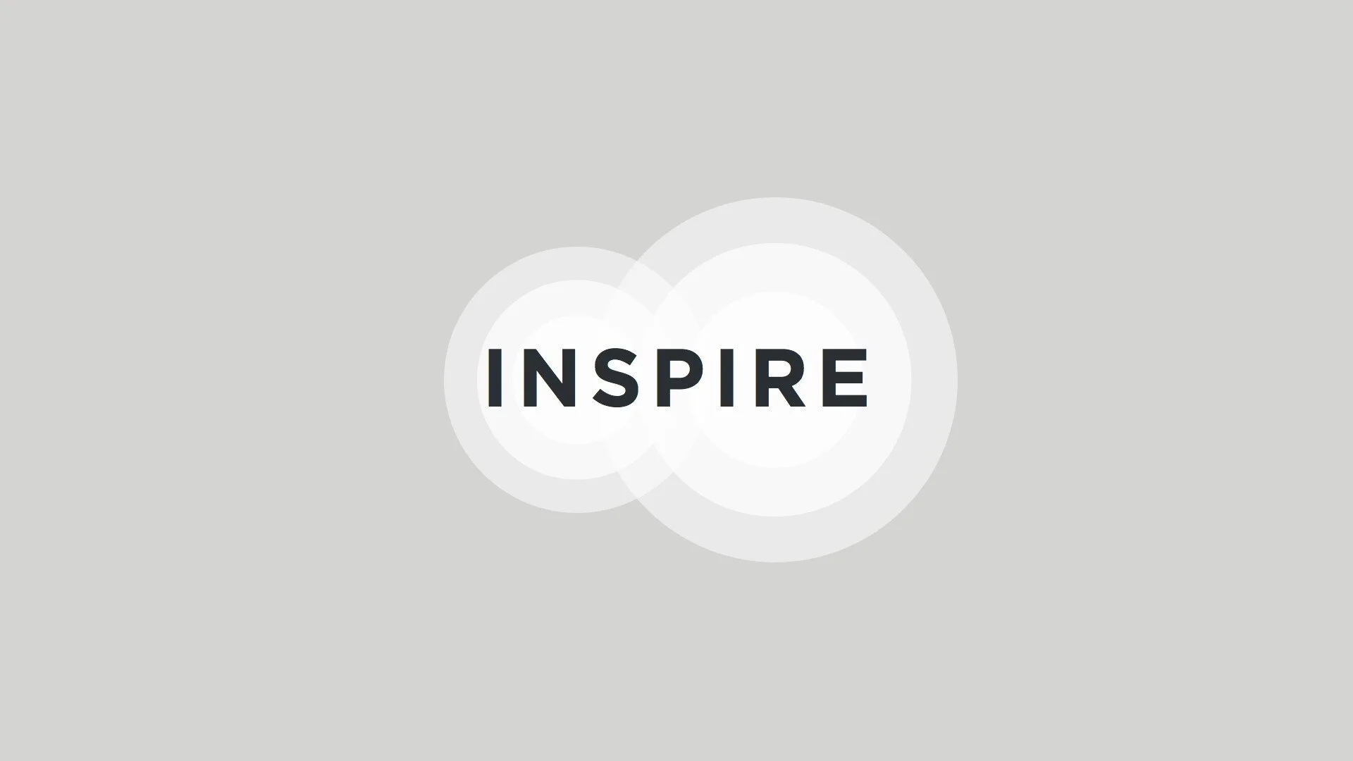
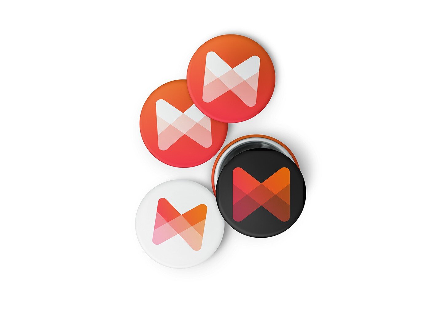
THE NEW LOGO.
Full of shades.
Always in sync.


Sketches

Mark anatomy
Part of the brandbook


A full guide of brand principles and applications.

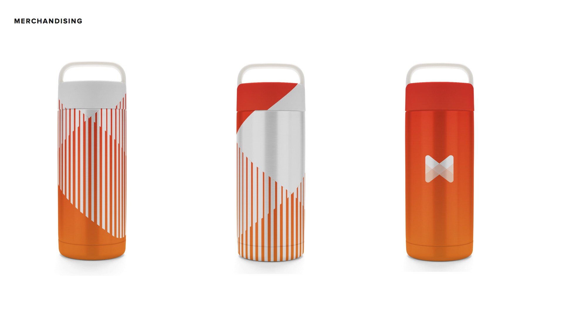
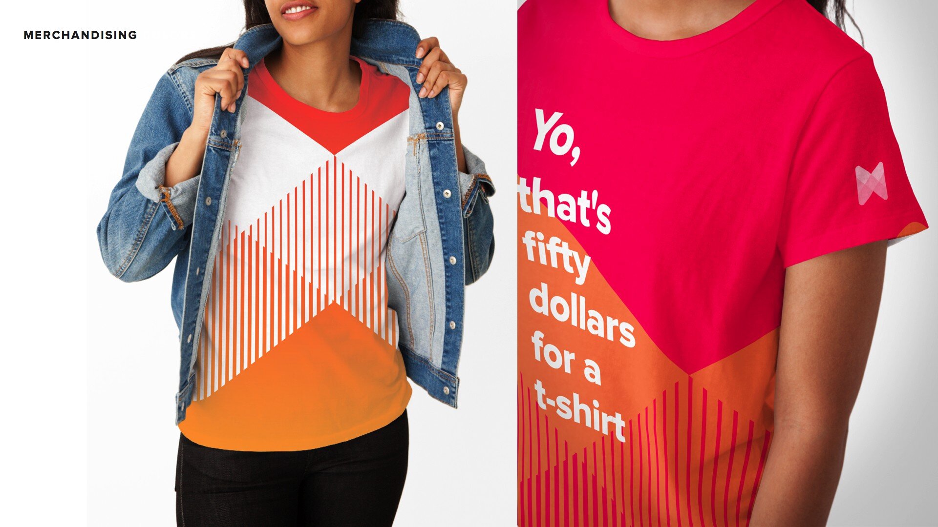
Swags!


Made with Love. ❤
After 2 intense months, I have learned that you have to test the logo 1000 times instead of 999, but also that you should not put it under discussion once you decide.